I hate sidewalks.
When I arrived in Paris the first shock I felt was how much space there was for people to move around. Even on boulevards with little pedestrian traffic, such as Boulevard Port-Royal, space is divided equally between pedestrian standing room, in other words place, and roads for vehicles. How many modern cities offer this kind of abundance? While, like all tourists, I loved the boulevards in Paris, I also became familiar enough with the city to find out that I disliked the little streets that branched off them. At first I thought that it was their boring, ordinary architecture and emptiness, but there were some exceptions. The pedestrian streets of the Marais and Latin Quarter were full of people and shops, which I assumed was exceptional due to their historic value. (Google Street View of a typical ordinary street of Paris.)
Late in the fall I returned to Montreal sufficiently alienated from it to be once again shocked by the contrast in street design. All I felt upon stepping out on the street was terrified and exposed. The snow and ice of winter only made the experience more dangerous. Despite the streets being wider than those of Paris, I am required to walk on narrow strips of concrete, where any slip or missed step would cause me to tumble into a road where a passing car would undoubtedly decapitate me. (In fact a few Montreal pedestrians were horrifically killed this winter.) Any contact with another pedestrian involves invading their personal space and requires that someone yield to the other. This means one cannot walk side-by-side with another person, taking away all the pleasure of walking. And out in the suburbs there isn't even the luxury of a concrete strip to stand on. Little wonder that no one wants to walk anywhere. Thinking back, I realized why I hated Paris' little streets: they forced me onto the sidewalk to make space for a road and car parking lane. There was no perspective from which to appreciate them because there was not even standing room in them.
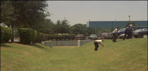
A picture of an early 19th century street scene shows that sidewalks were just a setback between the building and the street, a boundary to create a transition space between place and building. No one was expected to actually walk on them. The entire surface of the street belonged to pedestrians and vehicles equally. As a poor inhabitant of the late modern city, the street widenings and enormous open places of the 19th century appear to be unbelievable public luxury. There was an abundance of place even in the narrow medieval streets compared to what we enjoy in the modern city. Freedom of movement between one building to another was total. There were no obstacles, street furniture, traffic control devices of any kind.
The final effect, in the pictures above, is of an enormous place with randomly configured boundaries, even bigger than those in our modern suburban sprawl. Why is this not a cause of anxiety the way that modern sprawl is? Why does it appear so orderly despite the randomness? There is no clear explanation in either the historical literature or classical design treatises as to what makes a place. The reason for that I suspect is that place was simply the default state of things.
Maps of fortified towns during the renaissance show that many of them were just a completely open surface with a few randomly placed buildings. Towns started out as open land upon which you could do just about anything you wanted, including constructing buildings. Over a long time, with the building density increasing, it became necessary to keep streets open by imposing limits on how close new buildings could be from others, in effect defining a lower bound on the width of the street. But the street was not really something created, it was something that was preserved, the way blood vessels are voids between cell tissues. It was the combination of building randomness and circulation feedback that created the organic pattern of streets. In a traditional city then the problem was never about creating place, but about preventing too much of it from being consumed that the system became unworkable. When circulation problems arose anyway in the early 19th century, the solution was to remove buildings in congested areas and create more place. And so this is how Paris got its fractal pattern of streets: randomness, constraints, and feedback.
The pictures change around the turn of the 20th century, when mechanized vehicles start to take over the street. At this point pedestrians are being crowded out of their place and forced onto the sidewalks. The process may have been so gradual that hardly anyone noticed, but this seems to be what happened. The urbanists and architects of the early 20th century were right to denounce the congestion of the modern city. But what we see from the picture above is that the place occupied by vehicles is far less crowded than the space used by pedestrians. The crowding was purely artificial, the result of a process that no one may have been aware of. The introduction of the automobile then made things even more unbearable, but at this point European and American cities each took opposite turns.
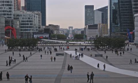
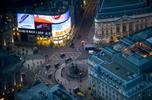
While the streetcar moved at the leisurely pace of the horse-drawn coach, the automobile's purpose was to go fast and cover distances that were beforehand too far. This could not be done in the congestion of the traditional street and required the production of an entirely new system of circulation, what later came to be called traffic engineering. American cities gleefully ripped up the streetcar tracks to make way for the new road system, literally driving place to the margins and choking main streets into economic starvation. In Europe the old tradition of place-preservation was applied and the new roads were only subtracted from place at a bare minimum, leaving about half of it left. That is how Boulevard Port-Royal remains so roomy for pedestrians, because there was no need to remove any more of it. And it is also why the design of Piccadilly Circus in London is so complex, balancing both traffic engineering and existing place improvements such as subway exits and fountains. By default, anything that doesn't need to be traffic engineered is left to place.
Even the problem of providing parking space can beautifully be solved by grouping parking into blocks surrounded by place. Here is a parking block in old Montreal. The dogma in parking planning has been that the parking lot must be between the building and the road, such that customers and visitors will easily see how to park and won't keep on driving right home, or the new dogma that parking lots must be hidden behind buildings because they are ugly and destroy urban space. Here however the parking is neither between the building and the street or behind the building, but across the street from the building. And it turns out to be unobtrusive, leaves plenty of open space to provide light and fresh air, and lets anyone walk right up to any building without having to cross a no man's land of vehicle storage.
In modern cities the process of place subtraction has been completely abolished. A modern urban development begins from a road and the road is extended through a parking lot to the entrance of the building. This was not the original modernist plan. Although the free-form street was supposed to be segregated into different pedestrian and automobile paths that would never intersect, the space set aside for pedestrians was gradually abandoned and removed entirely for various reasons, notably poor design and safety issues (as documented by Jane Jacobs). With place removed all that remained of the modernist process of urbanization was the road hierarchy. Sprawl was born out of this mutation.
Any available land that is not a building footprint is filled out with parking space or ornamental landscaping of fake nature. There is no space left over to place, although there is a sidewalk along the road.
Various movements to "reclaim the street" have sprung up in both Europe and America, sometimes going to zealous excesses (blocking Paris' périphérique beltway). They have mostly focused their efforts in traditional urban centers, with the latest victories being the proposal to close off part of Times Square to yellow taxicabs and other vehicles. Top traffic engineers like the late Hans Monderman have figured out that traffic flow is best when it's de-engineered, recreating place for better traffic flow at intersections. But what if we tried to reclaim place in suburban sprawl? What would it look like?
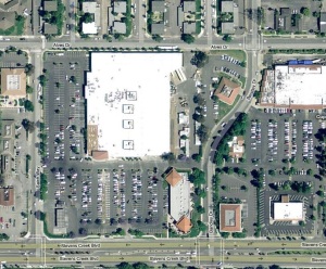
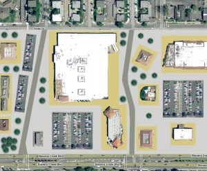
Although buildings are huge, randomly situated and separated by wide gulfs of space, that really did not appear to be a problem in the pictures above of 19th century cities. Let's try an experiment and assume that suburban sprawl has the same structure as a place-based city, then reintroduce road and parking lots within place, as was done in Europe. The example I will use is the area of the Target store in Cupertino, California, just down the road from the headquarters of Apple Computers within the world's richest sprawlopolis, Silicon Valley. I selected this site because the good people of Apple deserve to have a nice place to call home, and the biggest concentration of wealth in North America should have some kind of place to identify with.
This is our starting point. I bet you think it's hopeless. If I didn't come in equipped with a process to create a place I would have walked away (driven away more likely). But from what we know of how place was formed in traditional cities it turns out to be really simple to build a place there. First we have to remove everything that isn't a building and leave it as open space, the foundation for a place. Second, we draw a boundary around the buildings. Third, we reconnect the roads. Fourth, we add the parking blocks that the stores need to attract customers. And finally we spruce the place up with trees and other street furniture. The result doesn't look that bad:
Without having to demolish any of the buildings we have made a place out of what was a tragic cluster of sprawl.
At this point people are going to say that there probably isn't enough parking, or the roads might not be sufficient to accommodate the traffic, but the great thing about a place subtraction process is that you always have some space in reserve to fix unforeseen problems. So instead of building parking spaces in strangulating numbers, you can just convert place to parking lots as they become necessary. If it turns out that the parking is just right, you can build more buildings there and turn it into a little downtown. Of course as you do so density increases and open space disappears. It's a trade-off, but it's one that we have deprived ourselves of by insisting in our planning codes that everything be done right at the start, which means that we have too much of everything and nothing left over for people.
The biggest myth about sprawl is that it is low-density. In fact it is much too dense, every bit of space used for cars or buildings, which is why people are always complaining about wanting more open space.
French author Marc Augé initiated the study of the non-place, ultimately describing it as a space where meeting others is impossible. Place, an emergent product of traditional urbanization, was always simply taken for granted. It has taken enormous intellectual effort, after a complete elimination of place, to understand what exactly was lost and how. It will take a reconstruction of cities just as massive and a paradigm shift in the practice of traffic engineering to restore it. Until then whenever I am in a modern city I will stay in the car. As much as I love walking in town, I am not going to lose my life for it.
Reference
- The Geography of Nowhere by James Howard Kunstler, always a classic.
- A video series of Hans Monderman showing his work creating places in "engineered, technocratic" new towns of Holland. And here is an introduction to shared space.
Related Posts



Comments
You've hit on something good here. I too think a systematic approach to de-sprawling and re-placing is needed in the American metropolitan periphery. But what good do a few trees and benches do next to a drive-up bank? They will not spontaneously turn it into a sandwich cart, or turn the mega-store into a neighborhood plaza. Rather, we probably need t0 use new buildings *as ways of defining space*. Add shallow buildings to the arterial street frontage to reduce the apparent width of the street. Add paths through the large site, that connect across the minor roads to adjacent sites. Then, and only then, place your innovative adaptation of parking blocks *inside* the larger, well-defined space left inside the megablock. This way, you've created a small neighborhood, and it's one that people actually have to walk through, since their cars are there. What was once a parking lot becomes an outdoor extension of the mall; pushcarts set up there instead of being (ridiculously) placed in a mall's fake internal 'streets.' Moreover, it could actually be done: as malls vie for fewer customers who they want to stay longer, the convenience of parking becomes less important. In this vision, the walk to the car becomes part of the trip itself - just like in a real city neighborhood. This could slowly make the suburbs into the kinds of places where single-car and no-car households could live and thrive.
I think you're making things much more complicated than they need to be. The point is that open space by itself is a valuable land use, and that buildings connected by open space are what forms urban space. It doesn't matter how many buildings there are, in what density or in what configuration.
You don't need to add trees and benches. You only need to remove roads, parking lots and grass berms and replace them with nothing.
the principles you talk about are quite similar to the ones on which the swiss "zones de rencontre" are based:
http://zonederencontre.ch/home/zone_liste.aspx
In a "zone de rencontre" all street furniture related to traffic is removed. Both cars (whose speed is limited to 20 km/h) and pedestrian can use all of the space.
Mathieu,
I just found your blog, and I've really enjoyed what I've read so far, this post in particular!
I think the point you made about the conversion of streets to mechanical traffic funnels is extremely relevant, and the idea of 'space subtraction' is very insightful as well.
I've recently been writing about some similar stuff, and I've coined some terminology (or at least independently theorized, let me know if you've seen something similar!) that I find useful in describing the kind of stuff you're talking about! If you're interested, you can read these on my blog, it's a three part series, but part 3 has a summary of the first two that could save you time :)
Part 1 - http://www.neohouston.com/2009/03/property-value-theory-part-1-people-pr...
Part 2 - http://www.neohouston.com/2009/04/property-value-theory-part-2-interface...
Part 3 - http://www.neohouston.com/2009/04/property-value-theory-part-3-places-th...
Basically, in the terminology I've been using, the boulevards you loved retain an excellent interface while accommodating a vehicle conduit, but the side streets have too much conduit and not enough interface.
Fun stuff! Again I really enjoyed this post, thanks for writing it!
Mathieu,
A lot of food for thought here. I am not sure how your redesign of the Target complex isn't just prettier sprawl. What does the yellow area represent? What is the light gray area?
Are you familiar with the Boston City Hall? It has space around it that people do not want to be in. I am imagining your Target redesign would create similar space that people would not want to be in.
The yellow and gray area are just two distinct surfaces. You can put in anything you want as a material. The yellow area is a sidewalk in the traditional sense.
I've never been to Boston, but from what I can tell from Google Earth there are as many people around Boston City Hall as there are around Faneuil Hall across the street. It doesn't drive people away. It should be noted that Boston has very good street design overall, (much better than Montreal according to everybody who has seen it) so bad buildings stick out, but that doesn't mean that they interfere.
If you put yourself in the context of sprawl, where every building is a bad building, and where there is no street design, reconnecting strip commercial in this pattern is a significant and inexpensive improvement.
Hi Mathieu
PlastiCity FantastiCity is the DESIGN COMPETITION of 2010, we are searching for peculiar and playful ideas for the future city.
My name is Ben Kazacos. I am studying LA at RMIT Melbourne, Australia and this year I am part of the editing team for our annual journal, KERB18.
This year we are announcing KERB’s first ever international design competition PlastiCity FantastiCity, We would be very grateful if you could promote the competition on Emergent Urbanism
Our website will be up on the 23rd of October
We look forward to hearing from you. I can email you a copy of our comp brief along with images.
Kind Regards
Ben Kazacos (on behalf of the KERB18 editorial team)
you went to Paris and you used the word "hate"? A person born in Montreal, and still living there? How dare you??!!!! you are the saddest person I ever encounter on the internet.
How dare you compare Montreal to Paris? what the hell happened to you?you probably broke up with your girlfriend then went to Paris for some sort of comforting? ... Don't you think that "shock" and "hate" are a bit strong for your limited vocabulary? .... just because you are an unlucky person, it does not give you the right to talk about architecture and "big" street, perhaps you are too small for normal streets that you consider BIG.
Vivid and well written text, Mathieu. I am writing from a city which should be appointed as a "huge non-place treasure", Brasília. But it is not so easy: the city works, in a way. Your approach to urban design (as a "carver" ou a "reformer") must be based in (very) clear and strong assumptions about social behavior. You not assert those foundations and it would clarify those big problems with the "non-place" concept - as a starting poit to any sound design. Non-place emerges as an undeniable construct since Marc Augé coined it. There is something authoritarian in the way that theoretical construct denounces authority and its maladies. Environment-behavior studies should be called to make non-place discussions more substantive and refutable. Do you agree?
I don't see such a need. We need only observe ourselves to arrive at this conclusion. We are not studying animals, but our experience of space.